We're Hiring!
Help SendBird build the world's no. 1 messaging platform

This tutorial walks you through the steps necessary to build a custom UI for an iOS messaging app. It revises the default login view from the first tutorial into your shiney new app UI, using SendBird as an example.
Improve the User Interface with a custom UI
The next stage is to improve the user interface. You already used the default UI elements without customizing them.
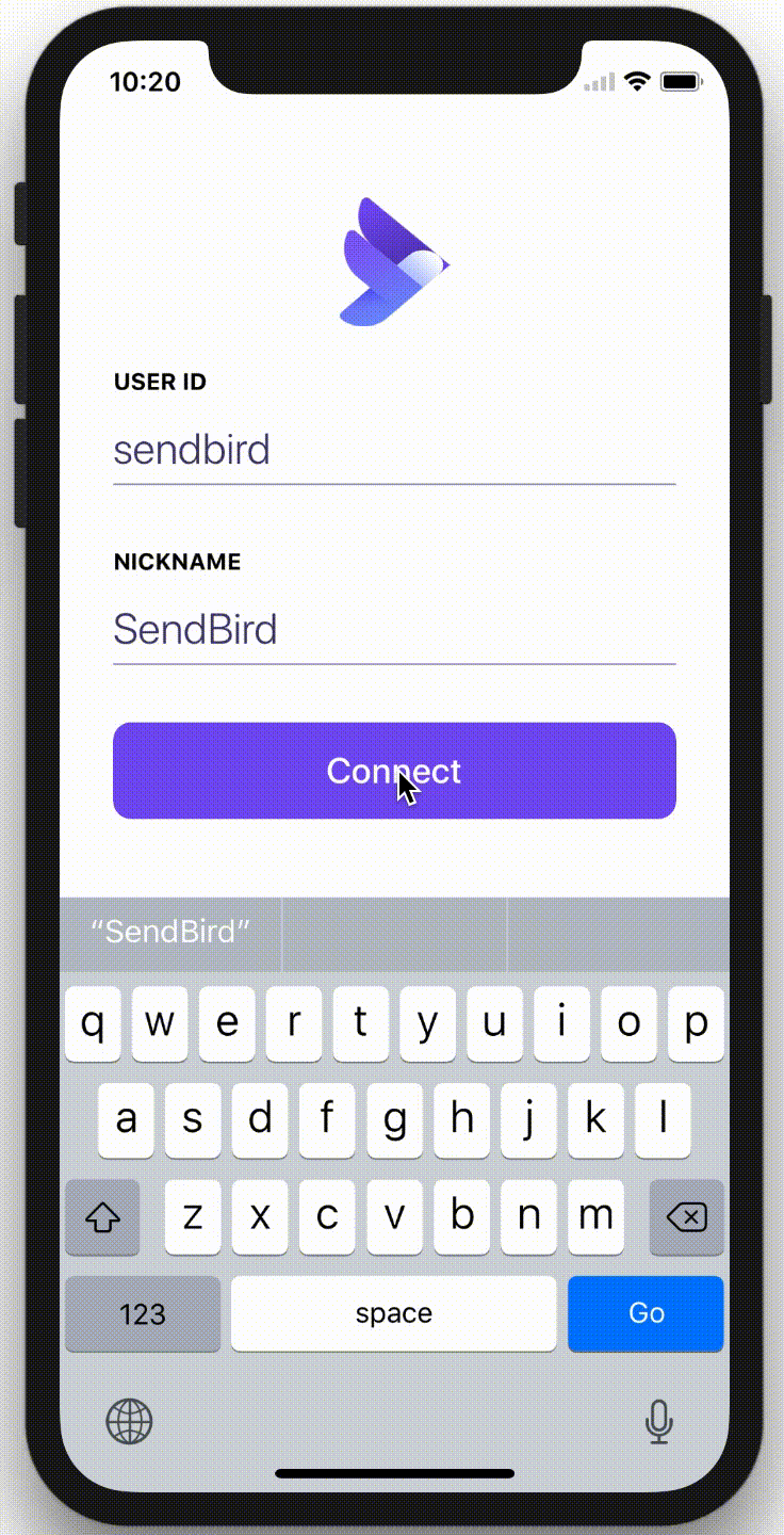
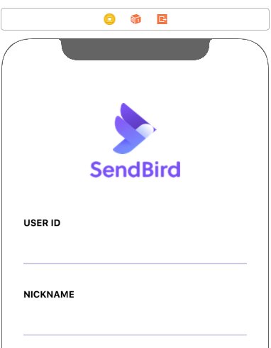
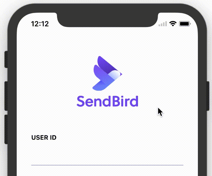
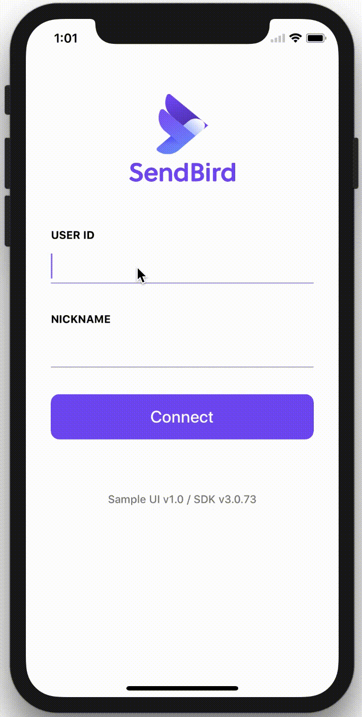
After you’re done, your iOS messaging app will look like the following image and animation.
You can run our iOS sample code at any time in our docs section.
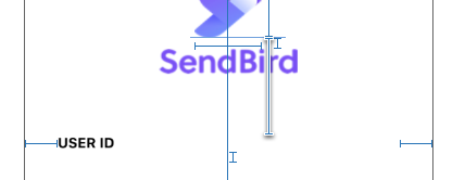
Adding the SendBird Logo
To display a logo with text underneath it, add a new UIImageView between SendBird Logo Image View and User ID Label. See the .gif above for an example of a UI that displays both a logo and the name associated with it. Change the new UIImageView’s name to SendBird Text Logo Image View. If you’d like to change the logo and name, you can do so in the Interface Builder.
Customize the UITextField
Create a custom text field and add a border line to the bottom of it. To accomplish this, add CustomTextField.m and CustomTextField.h
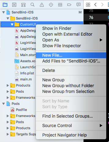
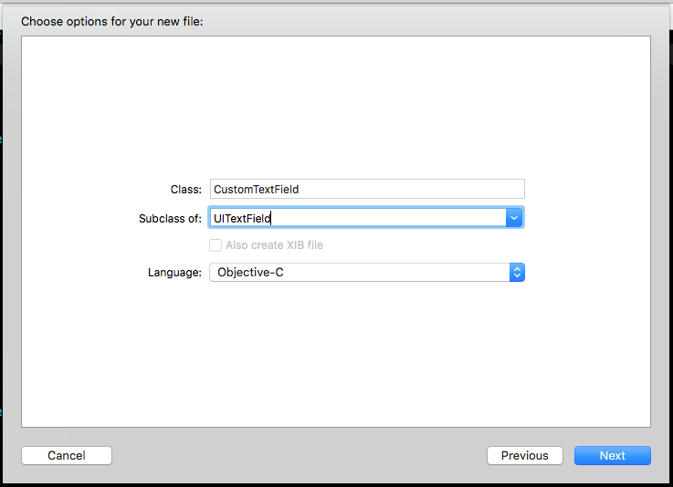
Right-click on the Project navigator and select New File.
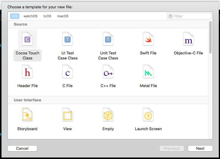
In the Choose a template for your new file dialog, choose Cocoa Touch Class and click Next.
Set the Class to CustomTextField and the Subclass of to UITextField. Click Next and then Create.
Open CustomTextField.h and add ID_DESIGNABLE for the Interface Builder.
To add custom properties associated with the bottom border color and the bottom border width, declare them with IBInspectable.
You can create a custom property in the Interface Builder with the IBInspectable attribute.
Open CustomTextField.m.
Add a CAShapeLayer property to @interface for drawing the bottom border. When re-drawing the text field, the instance of the property will be removed from a super layer.
Edit the drawRect: method. The drawRect: method renders the custom UI in the Interface Builder in real-time.
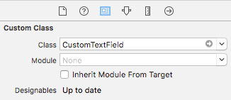
Open Main.storyboard and select User ID Text Field. Click the identity inspector on the right pane. Change the Class field to CustomTextField in the Custom Class section.
Click the Attribute Inspector on the right pane. Then you will see the Custom Text Field section, the Bottom Border Color, and the Bottom Border Width in the Interface Builder.
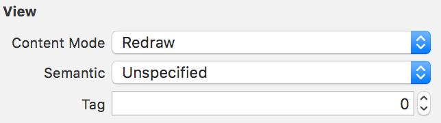
In the View section of the Attribute inspector, change the Content Mode to Redraw. This option will redraw the text field when rotating a device.
Now you’ll change the return key so it displays a different label for each location of the cursor in each text field (e.g. User ID or Nickname). In this tutorial, you’ll associate the Next label with the User Id text field and Go with the nickname text field. Clicking Go will connect to SendBird in the same way as clicking the Connect button will.
Change the Return Key in the Text Input Traits to Next on the Attribute Inspector. The return key in the User ID Text Field will move the cursor to the next text field.
Do the same thing to the Nickname Text Field. Change the Return Key in the Text Input Traits to Go on the Attribute inspector for the text field. The return key in the Nickname Text Field connects to SendBird.
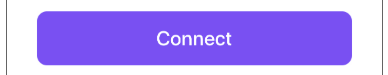
Customize the UIButton
Now we’ll create a rectangular Connect button with rounded corners.
For the custom button, create CustomButton.m and CustomButton.h like the CustomTextField.
Open CustomButton.h and add ID_DESIGNABLE for the Interface Builder.
Add a property for the corner radius with the IBInspectable attribute.
Open CustomButton.m and edit drawRect:.
Open Main.storyboard and select Connect Button. Click the identity inspector on the right pane. Change the Class field to CustomButton in the Custom Class section.
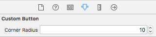
Set the Corner Radius. Now you will see the rounded corners on the button in the Interface Builder of Xcode.
Add an animation effect to the UI
Next, you’ll add some animation effects when the keyboard appears.
Connect a constraint between the top of the Content View and the SendBird Logo Image View to the sendbirdLogoImageViewTop outlet.

Connect the constraint between the bottom of the SendBird Logo Image View and the User ID Label to the userIdLabelTop outlet. Note that there is no constraint between the SendBird Text Logo Image View and the User ID Label.
Add a property for logo status. This will represent whether the text logo is hidden or visible.
Initialize the property in the viewDidLoad method.
Update the keyboardWillShow: method for the animation. The animation will hide the text logo and move the User ID Label up.
After you complete this section, the animation will look like it does below.
Set the action of the Return key
Add UITextFieldDelegate for the return key action of the keyboard. Open LoginViewController.h and add UITextFieldDelegate.
Open LoginViewController.m and set the delegate of two text fields in the viewDidLoad method.
Implement the connect method. To save time, re-use the code block that you already wrote in the clickConnectButton: method. Create a new connect method and move the code-block from the clickConnectButton: method to this new connect method by cutting-and-pasting it. The clickConnectButton: method must call the connect method. Use [self connect].
To set the action for the keyboard’s return key for each text field, add a delegate method.
Display the version of the sample project and SendBird SDK
The final UI element that you’ll modify is the Version Info Label. Display the sample version and the SendBird SDK version on the label. Retrieve the sample version from the info.plist file and the SendBird SDK version from the getSDKVersion method of SBDMain.
Completing the Login View
After making these changes, your UI should look and function like this.
You’ve now installed the SendBird SDK, connected to SendBird, created a LogIn page, and customized its UI.
We're Hiring!
Help SendBird build the world's no. 1 messaging platform